
studio arts
Eloise Roberts
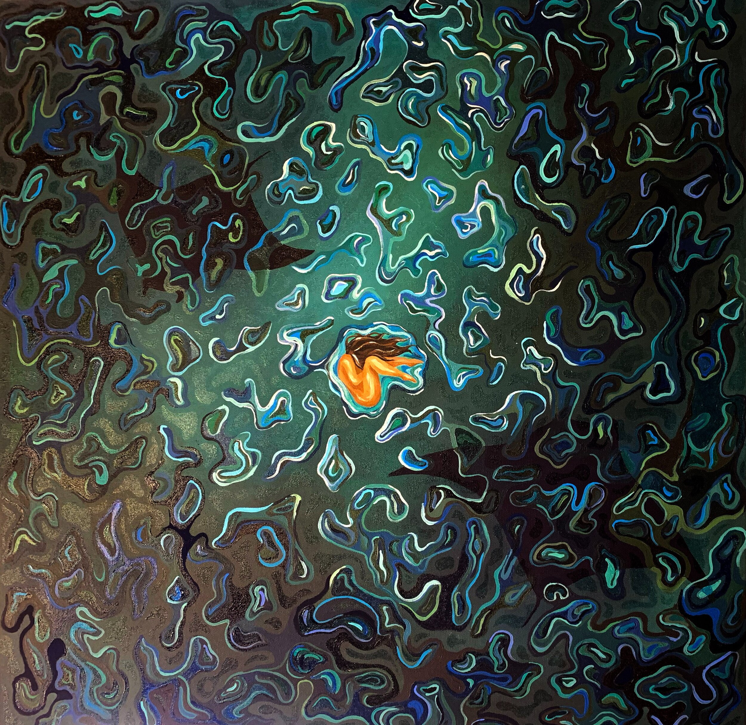

Above top: Untitled (Suspended in Time), acrylic painting, 71 x 71 cm, Above: Untitled (Suspended in Time), acrylic painting,40 x 125cm
In Unit Three I focused on many different aspects of ‘Suspended in Time’ drawing from both literal and figurative representations of the theme. I chose to refine my ideas down to the emotional side of ‘Suspended in Time’ illustrating the complex emotions of the human experience and fear in growing up. I explored how symbolism of water can be used to convey the movement of life, along with the depiction of abstract faces to represent the many emotions we can feel in a single moment.
I began looking at ‘Suspended in time’ though a few main pathways. exploring the complex human emotions and how expression comes from feeling multiple things at once, I also dived into the theme of childhood through sculpture and tapestry, along with examining the use of water as a symbol of passing time, playing with ideas of fear of the unknown and growing up. After exploring the many ways ‘Suspended in Time’ could be represented, I decided to elaborate on the ideas of overwhelming emotion and fear of the unknown.
The Potential Directions I chose to continue into refinement was Direction One, emotion and Direction Three, water. Direction One depicts five faces pulling and warping into each other, representing the combination of multiple emotions that can be felt in a single moment. I wanted the image to capture the inner feelings of someone at a specific point in time, illustrating how reactions are never driven by one feeling but a combination of many. Potential Direction Three portrays feelings of fear toward the unknown. The small, fragile central figure is surrounded by a vast dark ocean and is being circled by two large manta rays hidden under the water. Many symbols of birth and beginnings and intertwined with symbols of motion and fear to portray how holding on to the familiar safety of the past can be easier that succumbing to the unknown future. I chose to pursue these directions because not only was the composition of them the most refined in its idea, but the overarching message of the pieces had a stronger, more complex relationship with ‘Suspended in Time’. My other directions felt like the predictable choice for ‘Suspended in time’ looking at it very basically, through literal suspension of the sculpture and surrealism as a reference to frozen in time.
Going into Unit Four, I was relatively happy with my ideas and wasn’t sure how to improve them further but after multiple trials I found a lot could still be resolved. For my first artwork, using Potential Direction One, I made significant changes to my original idea though colour and materials. I decided to use vibrant colours for the face focusing on primary colours, instead of using natural skin tones because it opened the possibilities for viewer interpretation. Not only does it neutralise the figures and make them less identifiable, but it also stylises the subject making it abstract and depicting the emotions more as concepts than real people. To further enhance this, I made the face shapes resemble masks more than heads illuding putting on a false front. The other most significant change to Potential Direction One was the canvas. I initially wanted to paint on an acrylic mirror to incorporate themes of personal reflection, but I ended up really liking the effect of having a textured black background, I think it connects to the textured faces better and looks more cohesive. Adding a bright gloss allowed me to still incorporate reflection, while using texture as a link to the faces. Resolution of my second artwork was a lot more minor in changes as I had a solid idea at the end of Unit Three. I ended up doing many trials of how I wanted to paint the water, trying both stylised ripples and realistic, I landed on this dispersed cell shape design which complements the central figures naked fatal position both referencing birth and beginnings. I did, however, change the subject matter minorly, removing the koi fish as a symbol of balance as it didn’t add anything except a pop of colour to the piece and didn’t make much sense as koi fish aren’t found in Australian oceans! Finally resolving the colour palette making clear it is set at night, adding to the aesthetic qualities of the painting. I continued the idea of using gloss to enhance the moonlight affect.
My final artworks effectively communicate the theme of ‘Suspended in Time’. Artwork One captures the emotion of a singular moment through the merging feelings. Artwork Two portrays the dread of the unknown future through symbolism of the circling manta rays. These large rays are often feared for their size and connection to the deadly sting rays, but in reality, are gentle loving creatures. I thought this was a perfect metaphor to include depicting how the future may be a frightening thing, but that doesn’t mean it’s bad. I believe these artworks display a strong realisation of my ideas. The pieces are linked through materials, techniques, and concepts. The most prominent connection between artworks is the use of the art principal movement, both use implied movement to relate to time. The organic motion of the ripples represents the constant motion of life and the horizontal pull of the faces illustrates how quickly one emotion can become another. Similarly, both pieces look at the emotional side of time, Artwork One works with feeling overwhelmed and conflicted by different emotions that result in our human reactions to events while Artwork Two focuses on fear and uncertainty of growing up and holding on to the familiar past. Further cohesion though the use of gloss to create reflection and incorporate light enhancing aesthetic qualities. Similar dark aesthetics are seen due to the black surrounding in Artwork One and the dark ocean in Two. finally, the cohesion of the artworks extends to presentation where I decided to present both on black walls with spotlights creating unity.
For my first piece, I began drawing my design based on a digital collage of my face, wanting to warp all the faces before beginning. Using trails, I blocked red, blue and yellow to first gain an understanding of the lighting before using vibrant Acrylic colours to enhance the areas and create texture. Finally, I used thickened black paint in layers to create and contrasting background. Artwork Two was a much longer process, mostly consisting of countless trials getting each element right before assembling. After subject matter, my time consisted of layering many shapes and lines, continuously adding darker and lighter strokes creating implied depth and glowing surface. Both paintings were finished with acrylic gloss using lighting to express the aesthetic qualities.
Aesthetically, I want my work to create a sense of inner reflection for the viewer. The moody lighting and dark tones help to convey the dramatic feel of the artworks and intensify the aesthetics. Juxtaposing scale in the subject matter of each piece allows for ‘Suspended in Time’ to be viewed in different ways. The zoomed-out water painting enlists aesthetics of fear and uncertainty, the vast ocean contrasting the small central figure allows the viewer to feel meager and relate to the idea’s uneasiness. Conversely, the bright life-sized faces of artwork one confronts the viewer in a much louder way projecting the aesthetics of self-reflection. The intense texture along with bold contrast of colour with black enhances the mixed emotions of (from left to right) joy, overwhelmed, drained, sadness and rage. Using negative space and colour to create emphasis along with balance for the central image allows for the viewer to focus their reaction to a more condense space.
I decided to present my finished artworks as two acrylic paintings on canvas. The first 125 x 40cm thin edge and the second 71 x 71cm thick edge. I see them presented on separate walls, a corner or perpendicular, both at eye level this is so views can take in each artwork individually without the other one obstructing the view. The walls would be black ideally, to compliment the darker tones of both pieces, also complimenting the lighting. It is important that these artworks are present with light spotlights. Normal overhead lighting doesn’t capture the glow of the gloss which is necessary to gain the element of reflection in the artworks. A light angled spotlight allows for a gentle glow without overpowering the subject matter. having the paintings on separate walls also allows for them not to be affected by the opposing spotlight. I decided to go frameless for my presentation to pay homage to the ‘suspension’ of my theme. The void of black wall continuing to a frameless artwork imitates floating pieces. This presentation aims to maximise the viewers experience of the artworks.