
studio arts
Karine Fahmi
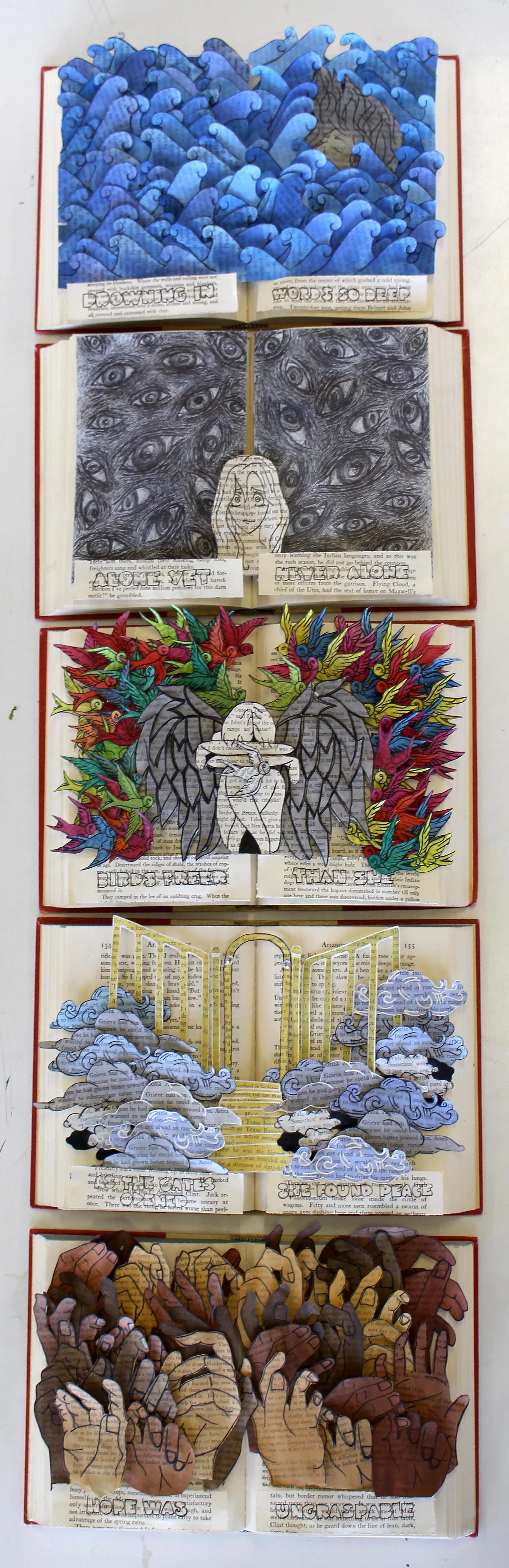
Above Top: The Viscious Cycle, multilayered, altered book, watercolour, 5 books, 15 x 23 x 6 cm.
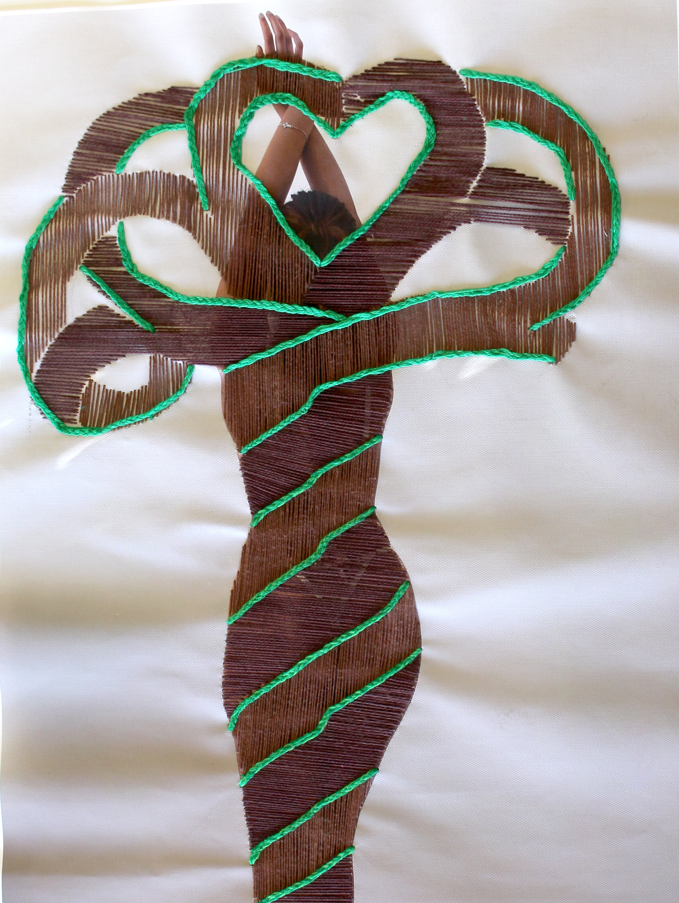
Above: Be one with the Tree, embroidery on coloured photography, 60.5 x 42 cm
The focus of my artwork in Unit 3 was the Human Condition, in particular, resolving the emotional aspect behind the specific stages experienced in life. This ultimately led me to contrast the idea of death and unfulfillment and the idea of rebirth and fulfilment. For my final artworks I decided to pursue potential direction one for my first artwork and potential direction four for my second artwork. I found that these directions communicated my ideas and artistically challenged me greater in comparison to the other potential directions. I selected potential direction one which set out to experiment multilayered altered novels, for the chosen use of the watercolour application on the novel pages. To the viewers, this effectively communicates my notion of storytelling onto an existing story. Similarly, I selected potential direction four which set out to incorporate the embroidery of the tree of life onto a photograph, for the chosen use of being able to reveal to the viewer the possibilities for a new beginning for an existing person through the thread. Essentially, I have created these artworks to be interpreted chronologically, in order to effectively communicate their means of storytelling. When resolving potential direction one, as opposed to a single page spread of layers per novel, I have expanded each of the five pieces to a double spread page, consisting of more layers and a wider variety of watercolours used and ultimately altered slight/drastic changes in the compositional subject matter depending on the novel. When resolving potential direction two, as opposed to sewing thread I used embroidery thread which was ultimately thicker and allowed for less gaps between the thread lines. I also changed the scale drastically from an A4 photograph printed on paper to a 42 X 60.5 cm photograph on matte canvas paper .
My final artworks effectively communicate my interest in the psychological turmoil different emotions have on individuals, more specifically the feeling of being stripped from ones freedom as a result of a lingering ever-presence of pain, contrasting with the symbolism of the tree of life that represents immortality and peak fulfilment and satisfaction in one’s life after the pain as passed. Both artworks cohesively illustrate my appeal for preciseness through the accuracy in the slicing of the pages using my exacto knife and the straightness of embroidery thread on the canvas paper. I believe that my final artworks are a promising representation of my artworks but potentially could have been explored and refined greater to emphasise this. My work communicates the ideas of connection to the story and the base canvas through layering and juxtaposing the images as a means of compounding the ideas of unfulfillment and fulfilment. Throughout my design process for both artworks, I explored sections of the human figure, in particular the human hands, eyes and body of a female and how they portray different emotions through the way actions and expressions are perceived. The two artworks I have created in my folio are linked in their means of storytelling through artform. The theme of the Human Condition and emotions is evident in each piece, but through contrasting emotions. Artwork one uses watercolour as its main medium in order for the words of the novel to still be visible through the paint, while the gaps between the embroidery thread in artwork two, allow the models body to be seen through in order to depict the individual as if they were the tree and the growing branches symbolise their growth as an individual. Each artwork is linked through the use of a simple composition, however, are in depth in their communication of turning something of the past (original book and photograph) into something of the present sense and future (layers of pages and thread). Aesthetically, I want my work to convey a sense of movement between artworks, having the novels equal in their size and evenly spaced, allows for the viewer to chronologically move through the series one by one and be drawn upwards to the embroidery placed above the novels. The harsh fine liner outline of layers in the books harmoniously tie the pieces together by distinguishing where the layers start and end. Similarly in the two pieces, the neutral nature of the base works, being the black and white novels and neutral photograph act as the canvas to the watercolour and embroidery thread which brings the pieces to life.
In my first finished artwork, I used five 15 x 23 cm old novels from a second hand book store and a standard watercolour disc comprised of 24 colours. Using grey led, I began sketching in one of my novels, a figure, depending on which part of my series I was working on. I would repeat this until I had my desired amount of layers. This process varied depending on the part of series, where some of them required more or less layers than the previous one. Slicing with my exacto knife and scissors, I individually cut out each sketch and traced its outline. This process was tedious as trying to precisely slice every edge and dent in the sketches became time consuming and I often found the pages would tear if I applied too much pressure to the page. I finalised my sketches using the watercolour wheel to carefully paint each layer one at a time. I initially applied a thin layer of the watercolour onto the page, thin enough for the words of the novel to still be visible through the page. Once I was satisfied, I applied square pieces of foam board to each layers back and arranged the cut paintings accordingly on the double spread page in my novel. I found that this element of my artwork made it look more complete and gave it greater depth. To conclude, I mimicked a style of block writing from the internet and used fine liner to write the phrase I paired with the corresponding series and inserted it at the bottom of the pages. I repeated this process four more times, unique depending on which piece I was working on. One aspect that I had found challenging was changing Billie Martens lyrics to my own, as I preferred hers much more than mine. I also found it was time consuming waiting for the paint to dry for each layer in order for me to complete one series, however this pushed me to work on more than one novel at a time, which overall sped up the creation time. In my second artwork using an iPhone 11, I conducted a photoshoot of my model trialling different full body positions. I limited my decision to one image which illustrated the models back faced towards the camera, arms stretched high above her head and legs twisted. This was to act as the base to my embroidery of the tree of life. Using a large format ink jet printer, I printed my chosen photograph onto heavy weight matter canvas paper 42 X 60.5. Using grey led, I used the silhouette of the body as a guide to sketch the trees trunk and the arms as a guide for the branches. I allocated sections dedicated to light brown (vertical direction) and dark brown (horizontal direction) embroidery thread. When roughly sketching, my aim was to create a tree where the branches had no start and no end to resemble immortality which is symbolic of the tree of life. Although this process was simple to sketch, it became very difficult to reflect this when threading. Cutting off an appropriate amount of thread I tied a knot at the bottom of the thread and began threading, beginning with inserting my needle from the back. I found that during the threading process, leaving a little bit of a gap between the thread would have been more successful, as I found that a minimal amount of the photograph can be seen through the thread as a result which defeats the purpose. After completely the branches and trunk, using light and dark green thread I braided multiple stands and placed them along the branches to resemble vines and leaves. One aspect that I had found challenging was the time commitment. When trialling on a smaller scale in unit 3 and the beginning of unit 4 it was far quicker, and I had not anticipated the several hours a day I found myself working. I also found that it was very tedious and precise to create in order to make sure every line was straight and not too many holes were being falsely poked to preserve its neatness.
I decided to present my finished artworks with artwork one evenly spaced on five plinths in the foreground, allocating one book per plinth, where two plinths will be placed forward and three will be placed precisely between the gaps behind the two plinths. Artwork two will be displayed behind the five plinths on a large rectangular black felt board, with the piece pinned symmetrically centred to the plinths. This presentation is done so, in order for the audience to interpret the pieces chronologically. I aim for the movement to travel from the first plinth (furthest left) to the fifth plinth (furthest right), then to travel backwards to the embroidered photograph, in order to expand on the notion of my theme The Human Condition and the movement through the stages of life I have targeted.